圖表視覺化#
注意
以下範例假設您使用 Jupyter。
本節說明透過繪製圖表進行視覺化。如需有關資料表資料視覺化的資訊,請參閱 資料表視覺化 一節。
我們使用標準慣例來參照 matplotlib API
In [1]: import matplotlib.pyplot as plt

In [2]: plt.close("all")
我們在 pandas 中提供基礎知識,以便輕鬆建立美觀的圖表。請參閱 生態系統頁面,以取得超出本文檔中所述基礎知識的視覺化程式庫。
注意
對 np.random 的所有呼叫都以 123456 為種子。
基本繪圖: plot#
我們將展示基礎知識,請參閱 食譜,以取得一些進階策略。
Series 和 DataFrame 上的 plot 方法只是一個簡單的包裝器,用於 plt.plot()
In [3]: np.random.seed(123456)

In [4]: ts = pd.Series(np.random.randn(1000), index=pd.date_range("1/1/2000", periods=1000))

In [5]: ts = ts.cumsum()

In [6]: ts.plot();
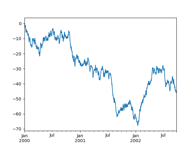
如果索引包含日期,它會呼叫 gcf().autofmt_xdate() 以嘗試根據上述內容漂亮地格式化 x 軸。
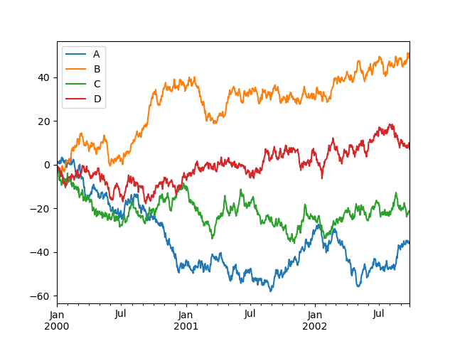
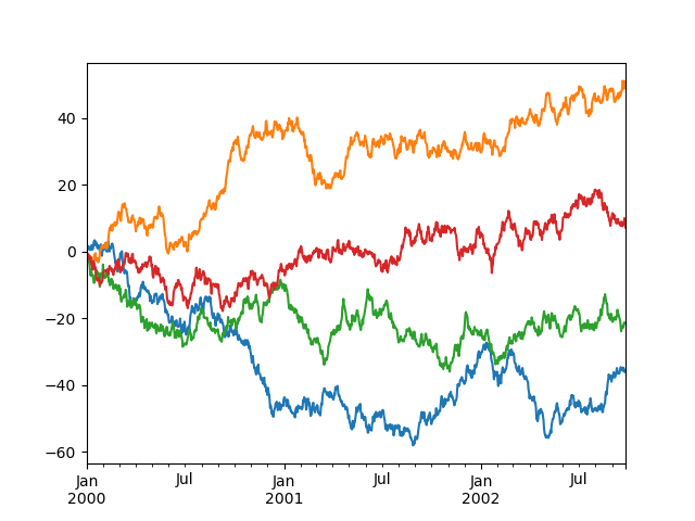
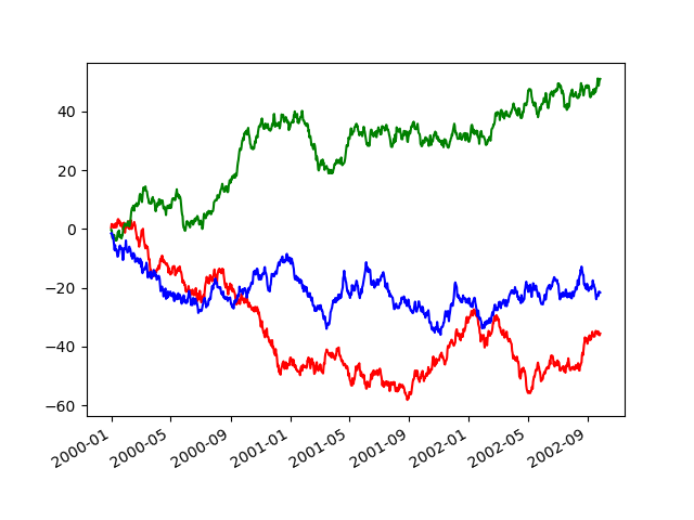
在 DataFrame 上,plot() 是用於繪製所有帶標籤的欄位的便利性
In [7]: df = pd.DataFrame(np.random.randn(1000, 4), index=ts.index, columns=list("ABCD"))

In [8]: df = df.cumsum()

In [9]: plt.figure();

In [10]: df.plot();
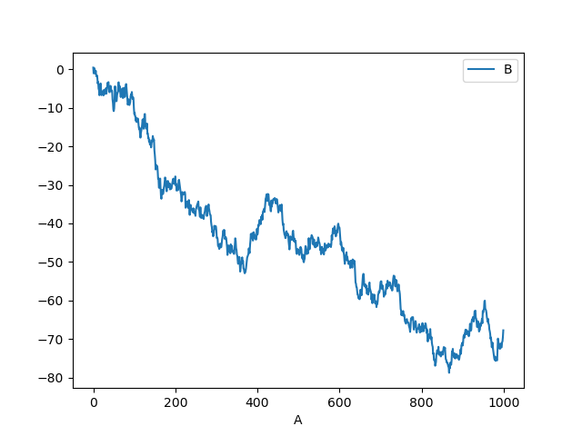
您可以使用 plot() 中的 x 和 y 關鍵字來繪製一欄與另一欄
In [11]: df3 = pd.DataFrame(np.random.randn(1000, 2), columns=["B", "C"]).cumsum()

In [12]: df3["A"] = pd.Series(list(range(len(df))))

In [13]: df3.plot(x="A", y="B");
注意
如需更多格式化和樣式選項,請參閱下方的 格式化。
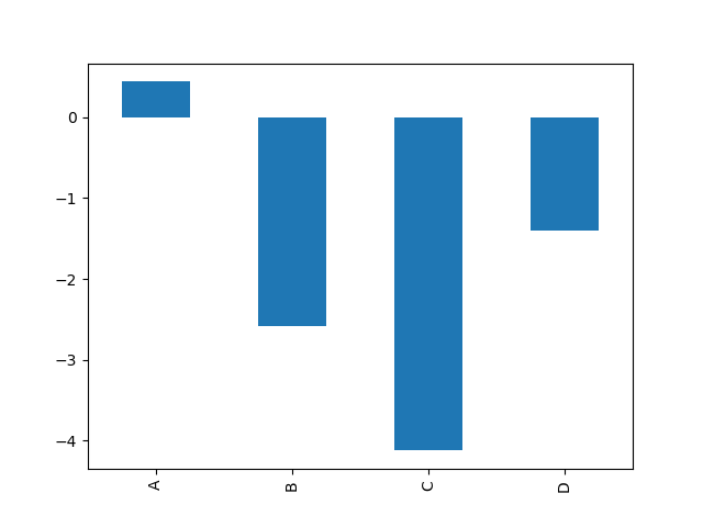
其他繪圖#
繪圖方法允許使用少數繪圖樣式,而不是預設的折線圖。這些方法可以提供為 plot() 的 kind 關鍵字引數,並包含
例如,可以透過以下方式建立長條圖
In [14]: plt.figure();

In [15]: df.iloc[5].plot(kind="bar");
您也可以使用 DataFrame.plot.<kind> 方法建立這些其他繪圖,而不是提供 kind 關鍵字引數。這使得更容易發現繪圖方法和它們使用的特定引數
In [16]: df = pd.DataFrame()

In [17]: df.plot.<TAB>  # noqa: E225, E999
df.plot.area     df.plot.barh     df.plot.density  df.plot.hist     df.plot.line     df.plot.scatter
df.plot.bar      df.plot.box      df.plot.hexbin   df.plot.kde      df.plot.pie
除了這些 kind 之外,還有 DataFrame.hist() 和 DataFrame.boxplot() 方法,它們使用一個單獨的介面。
最後,在 pandas.plotting 中有幾個 繪圖函數,它們將 Series 或 DataFrame 作為一個引數。這些包括
長條圖#
對於標籤化、非時間序列資料,您可能希望產生一個長條圖
In [18]: plt.figure();

In [19]: df.iloc[5].plot.bar();

In [20]: plt.axhline(0, color="k");
呼叫 DataFrame 的 plot.bar() 方法會產生一個多重長條圖
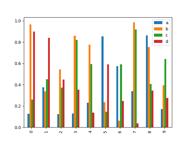
In [21]: df2 = pd.DataFrame(np.random.rand(10, 4), columns=["a", "b", "c", "d"])

In [22]: df2.plot.bar();
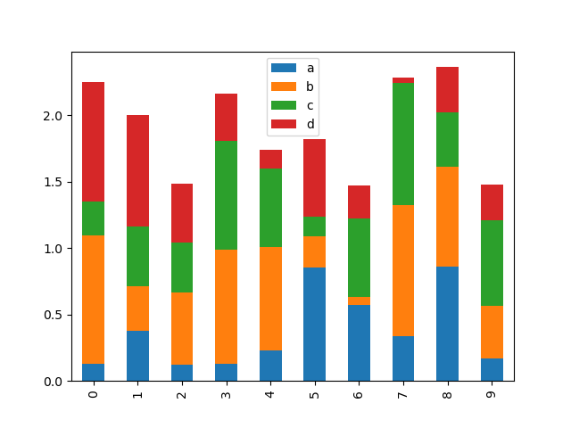
要產生一個堆疊長條圖,請傳遞 stacked=True
In [23]: df2.plot.bar(stacked=True);
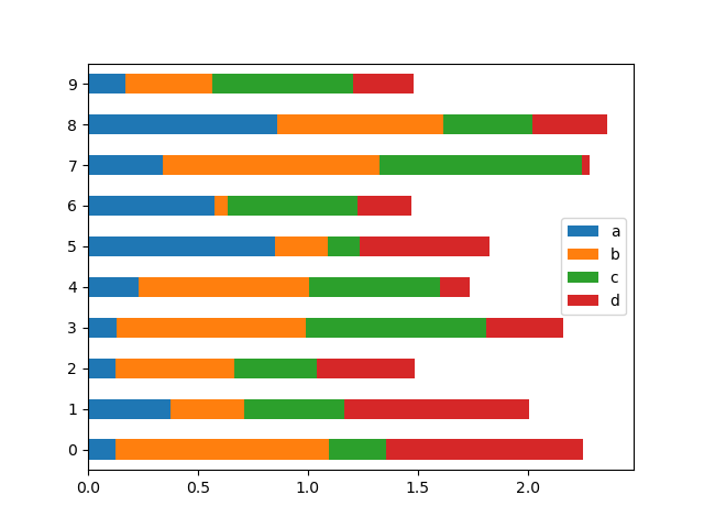
若要取得水平長條圖,請使用 barh 方法
In [24]: df2.plot.barh(stacked=True);
直方圖#
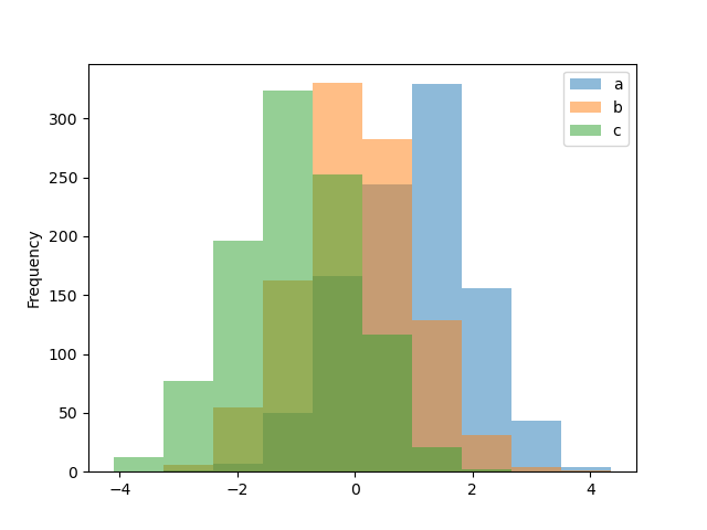
可使用 DataFrame.plot.hist() 和 Series.plot.hist() 方法繪製直方圖。
In [25]: df4 = pd.DataFrame(
   ....:     {
   ....:         "a": np.random.randn(1000) + 1,
   ....:         "b": np.random.randn(1000),
   ....:         "c": np.random.randn(1000) - 1,
   ....:     },
   ....:     columns=["a", "b", "c"],
   ....: )
   ....:

In [26]: plt.figure();

In [27]: df4.plot.hist(alpha=0.5);
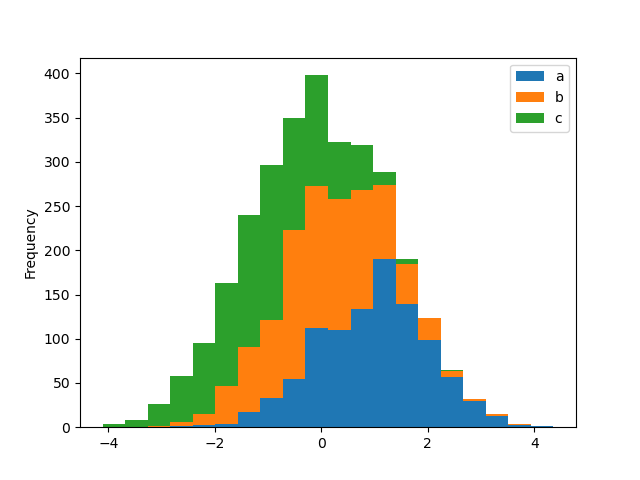
可使用 stacked=True 堆疊直方圖。可使用 bins 關鍵字變更區間大小。
In [28]: plt.figure();

In [29]: df4.plot.hist(stacked=True, bins=20);
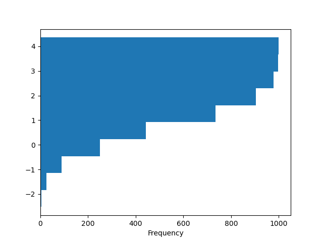
您可以傳遞 matplotlib hist 支援的其他關鍵字。例如,可使用 orientation='horizontal' 和 cumulative=True 繪製水平和累積直方圖。
In [30]: plt.figure();

In [31]: df4["a"].plot.hist(orientation="horizontal", cumulative=True);
請參閱 hist 方法和 matplotlib 直方圖文件 以取得更多資訊。
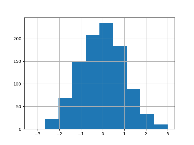
仍可使用現有的介面 DataFrame.hist 來繪製直方圖。
In [32]: plt.figure();

In [33]: df["A"].diff().hist();
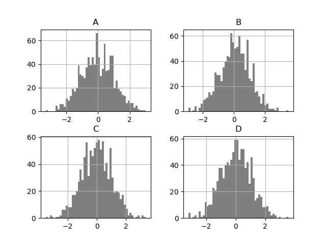
DataFrame.hist() 在多個子圖上繪製直方圖
In [34]: plt.figure();

In [35]: df.diff().hist(color="k", alpha=0.5, bins=50);
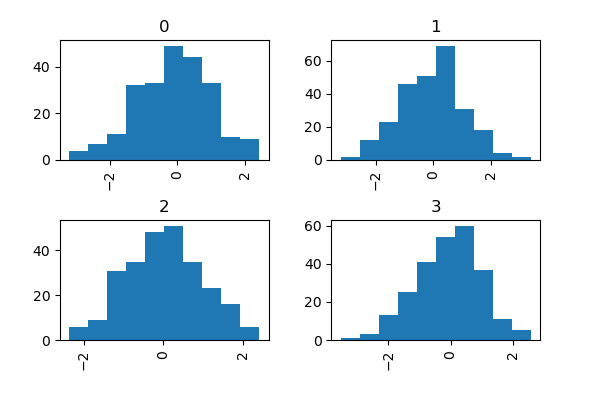
可指定 by 關鍵字來繪製群組直方圖
In [36]: data = pd.Series(np.random.randn(1000))

In [37]: data.hist(by=np.random.randint(0, 4, 1000), figsize=(6, 4));
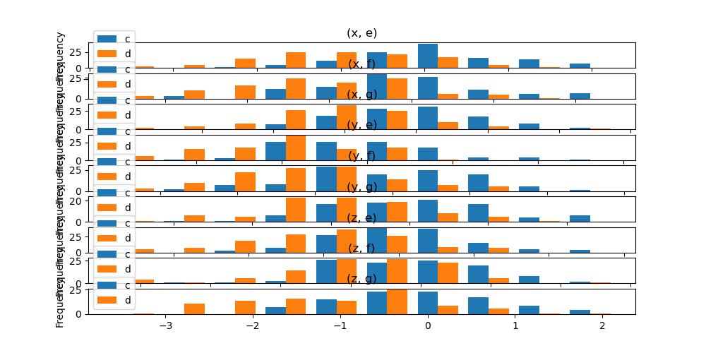
此外,by 關鍵字也可以指定在 DataFrame.plot.hist() 中。
在版本 1.4.0 中已變更。
In [38]: data = pd.DataFrame(
   ....:     {
   ....:         "a": np.random.choice(["x", "y", "z"], 1000),
   ....:         "b": np.random.choice(["e", "f", "g"], 1000),
   ....:         "c": np.random.randn(1000),
   ....:         "d": np.random.randn(1000) - 1,
   ....:     },
   ....: )
   ....:

In [39]: data.plot.hist(by=["a", "b"], figsize=(10, 5));
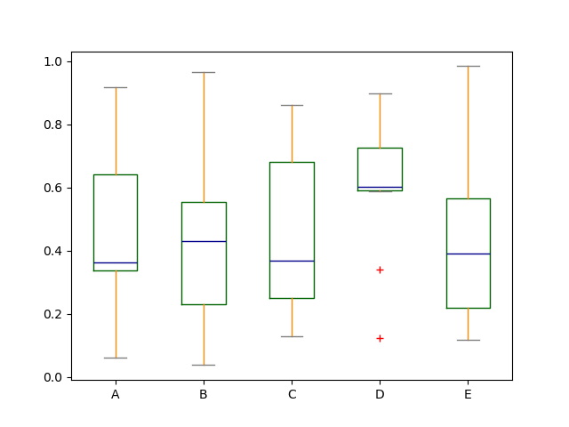
箱型圖#
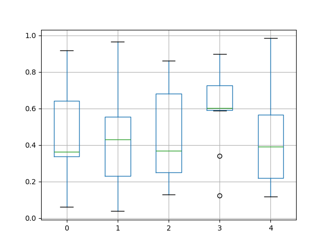
箱型圖可以透過呼叫 Series.plot.box() 和 DataFrame.plot.box(),或 DataFrame.boxplot() 來繪製,以視覺化每一欄位中的數值分佈。
例如,以下是一個箱型圖,代表在 [0,1) 上的均勻隨機變數的 10 次觀測的五次試驗。
In [40]: df = pd.DataFrame(np.random.rand(10, 5), columns=["A", "B", "C", "D", "E"])

In [41]: df.plot.box();

箱型圖可以透過傳遞 color 關鍵字來上色。你可以傳遞一個 dict,其鍵為 boxes、whiskers、medians 和 caps。如果 dict 中缺少一些鍵,則對應的藝術家將使用預設顏色。此外,箱型圖有 sym 關鍵字來指定異常值樣式。
當你透過 color 關鍵字傳遞其他類型的引數時,它將直接傳遞給 matplotlib,以進行所有 boxes、whiskers、medians 和 caps 的上色。
色彩會套用至每個要繪製的方塊。如果您想要更複雜的色彩效果,您可以透過傳遞 return_type 來取得每個繪製的藝術家。
In [42]: color = {
   ....:     "boxes": "DarkGreen",
   ....:     "whiskers": "DarkOrange",
   ....:     "medians": "DarkBlue",
   ....:     "caps": "Gray",
   ....: }
   ....:

In [43]: df.plot.box(color=color, sym="r+");
此外,您也可以傳遞 matplotlib 支援的其他關鍵字 boxplot。例如,可以透過 vert=False 和 positions 關鍵字來繪製水平和自訂位置的箱形圖。
In [44]: df.plot.box(vert=False, positions=[1, 4, 5, 6, 8]);
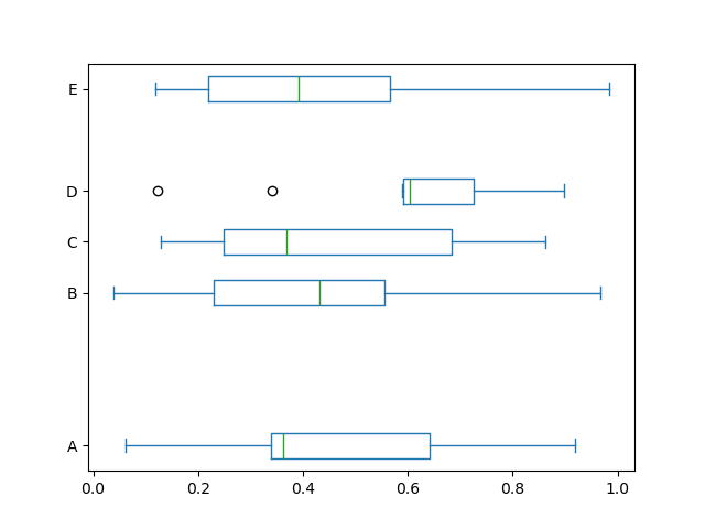
請參閱 boxplot 方法和 matplotlib 箱形圖文件 以取得更多資訊。
現有的介面 DataFrame.boxplot 仍可使用來繪製箱形圖。
In [45]: df = pd.DataFrame(np.random.rand(10, 5))

In [46]: plt.figure();

In [47]: bp = df.boxplot()
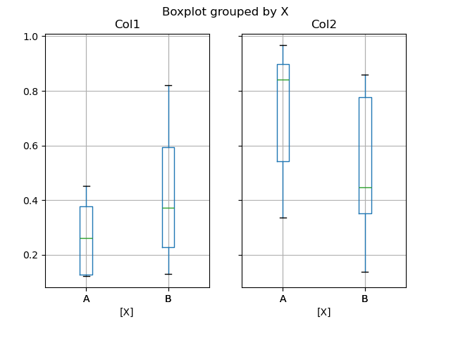
您可以使用 by 關鍵字引數建立分層箱形圖來建立分組。例如:
In [48]: df = pd.DataFrame(np.random.rand(10, 2), columns=["Col1", "Col2"])

In [49]: df["X"] = pd.Series(["A", "A", "A", "A", "A", "B", "B", "B", "B", "B"])

In [50]: plt.figure();

In [51]: bp = df.boxplot(by="X")
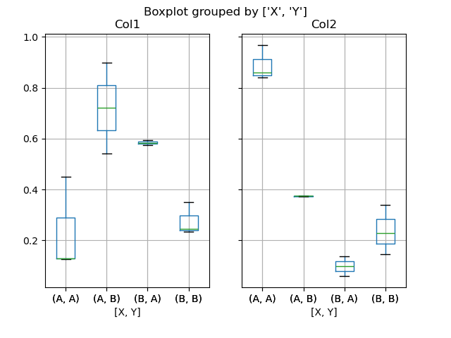
您也可以傳遞要繪製的子集欄位,以及依據多個欄位分組
In [52]: df = pd.DataFrame(np.random.rand(10, 3), columns=["Col1", "Col2", "Col3"])

In [53]: df["X"] = pd.Series(["A", "A", "A", "A", "A", "B", "B", "B", "B", "B"])

In [54]: df["Y"] = pd.Series(["A", "B", "A", "B", "A", "B", "A", "B", "A", "B"])

In [55]: plt.figure();

In [56]: bp = df.boxplot(column=["Col1", "Col2"], by=["X", "Y"])
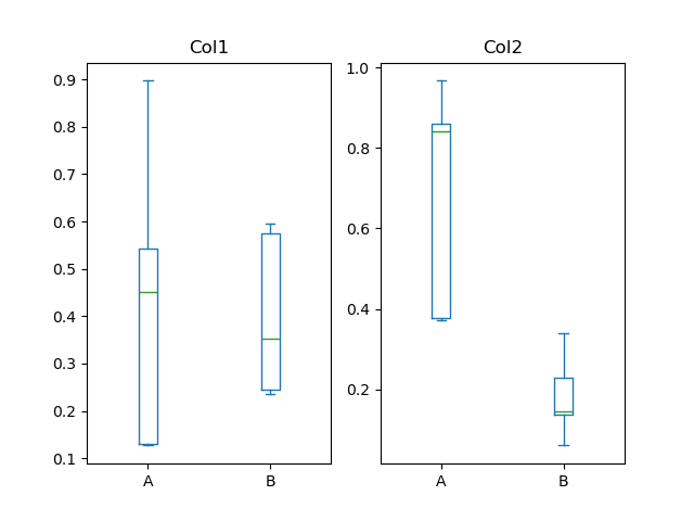
您也可以使用 DataFrame.plot.box() 建立分組,例如:
在版本 1.4.0 中已變更。
In [57]: df = pd.DataFrame(np.random.rand(10, 3), columns=["Col1", "Col2", "Col3"])

In [58]: df["X"] = pd.Series(["A", "A", "A", "A", "A", "B", "B", "B", "B", "B"])

In [59]: plt.figure();

In [60]: bp = df.plot.box(column=["Col1", "Col2"], by="X")
在 boxplot 中,回傳類型可以透過 return_type 關鍵字來控制。有效選項為 {"axes", "dict", "both", None}。由 DataFrame.boxplot 使用 by 關鍵字建立的分面也會影響輸出類型
|
分面 |
輸出類型 |
|---|---|---|
|
否 |
axes |
|
是 |
2-D ndarray 的軸 |
|
否 |
axes |
|
是 |
軸的序列 |
|
否 |
藝術家的字典 |
|
是 |
藝術家字典的序列 |
|
否 |
namedtuple |
|
是 |
namedtuple 的序列 |
Groupby.boxplot 始終傳回 Series 的 return_type。
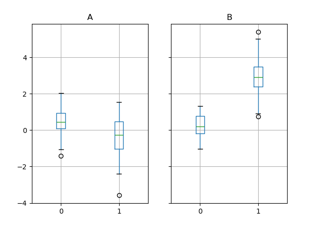
In [61]: np.random.seed(1234)

In [62]: df_box = pd.DataFrame(np.random.randn(50, 2))

In [63]: df_box["g"] = np.random.choice(["A", "B"], size=50)

In [64]: df_box.loc[df_box["g"] == "B", 1] += 3

In [65]: bp = df_box.boxplot(by="g")
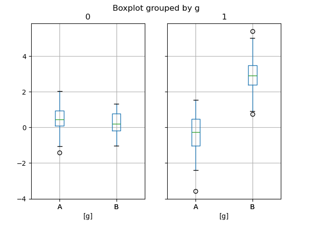
上面的子區塊圖首先按數字欄位區分,然後按 g 欄位的數值區分。子區塊圖下方首先按 g 的數值區分,然後按數字欄位區分。
In [66]: bp = df_box.groupby("g").boxplot()
面積圖#
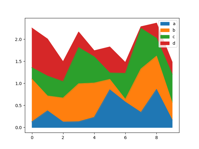
您可以使用 Series.plot.area() 和 DataFrame.plot.area() 建立面積圖。面積圖預設為堆疊。若要產生堆疊面積圖,每一欄必須都是全為正值或全為負值。
當輸入資料包含 NaN 時,系統會自動填入 0。如果您想刪除或填入不同的數值,請在呼叫 plot 之前使用 dataframe.dropna() 或 dataframe.fillna()。
In [67]: df = pd.DataFrame(np.random.rand(10, 4), columns=["a", "b", "c", "d"])

In [68]: df.plot.area();
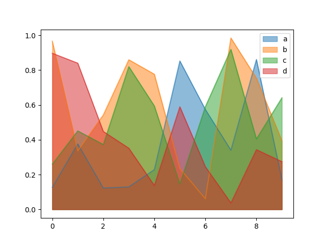
若要產生非堆疊圖,請傳遞 stacked=False。除非另有指定,否則 Alpha 值設為 0.5
In [69]: df.plot.area(stacked=False);
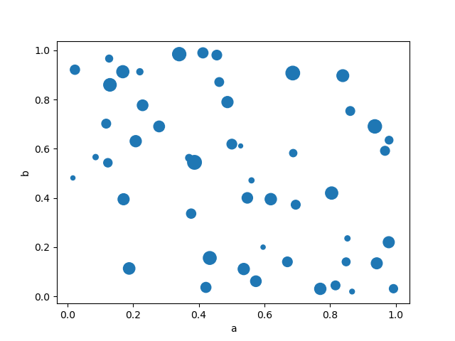
散佈圖#
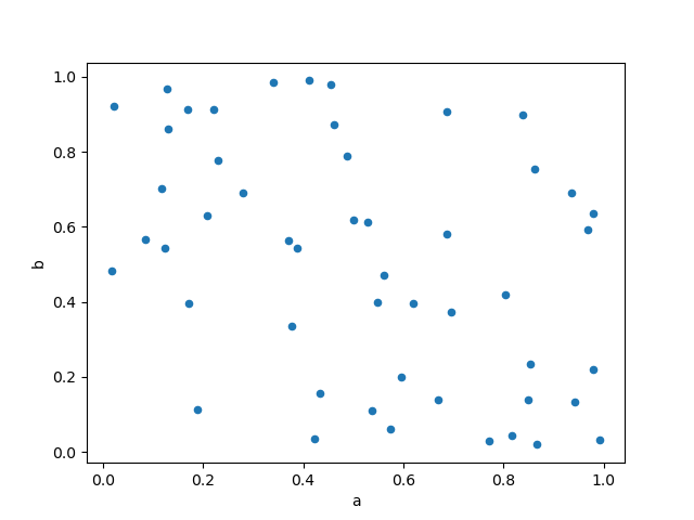
散佈圖可以使用 DataFrame.plot.scatter() 方法繪製。散佈圖需要數值欄位作為 x 和 y 軸。這些欄位可以使用 x 和 y 關鍵字指定。
In [70]: df = pd.DataFrame(np.random.rand(50, 4), columns=["a", "b", "c", "d"])

In [71]: df["species"] = pd.Categorical(
   ....:     ["setosa"] * 20 + ["versicolor"] * 20 + ["virginica"] * 10
   ....: )
   ....:

In [72]: df.plot.scatter(x="a", y="b");
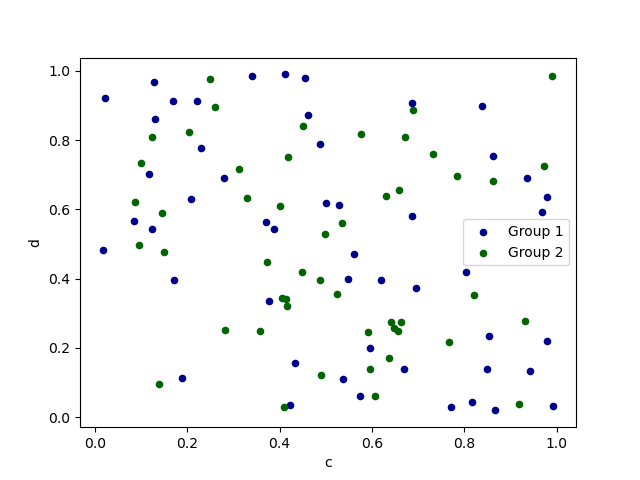
要在單一軸線上繪製多個欄位組,請重複指定目標 ax 的 plot 方法。建議指定 color 和 label 關鍵字以區分每個組。
In [73]: ax = df.plot.scatter(x="a", y="b", color="DarkBlue", label="Group 1")

In [74]: df.plot.scatter(x="c", y="d", color="DarkGreen", label="Group 2", ax=ax);
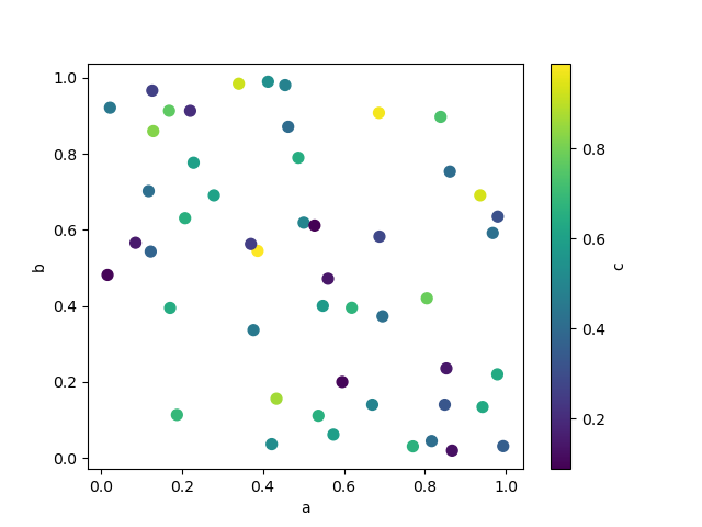
關鍵字 c 可以指定為一個欄位的名稱,以提供每個點的顏色
In [75]: df.plot.scatter(x="a", y="b", c="c", s=50);
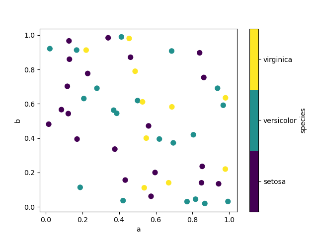
如果傳遞分類欄位給 c,則會產生離散的色彩條
1.3.0 版的新功能。
In [76]: df.plot.scatter(x="a", y="b", c="species", cmap="viridis", s=50);
你可以傳遞 matplotlib 支援的其他關鍵字 scatter。以下範例顯示一個氣泡圖,使用 DataFrame 的一個欄位作為氣泡大小。
In [77]: df.plot.scatter(x="a", y="b", s=df["c"] * 200);
請參閱 scatter 方法和 matplotlib 散佈圖文件 以取得更多資訊。
六角形箱形圖#
你可以使用 DataFrame.plot.hexbin() 來建立六角形箱形圖。如果你的資料過於密集,無法個別繪製每個點,六角形箱形圖會是一個有用的替代方案。
In [78]: df = pd.DataFrame(np.random.randn(1000, 2), columns=["a", "b"])

In [79]: df["b"] = df["b"] + np.arange(1000)

In [80]: df.plot.hexbin(x="a", y="b", gridsize=25);
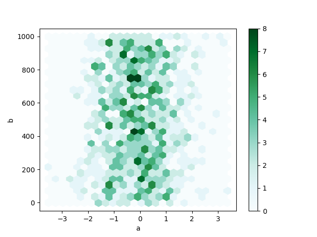
一個有用的關鍵字參數是 gridsize;它控制 x 方向的六角形數量,預設為 100。較大的 gridsize 表示更多、更小的箱形圖。
預設情況下,會計算每個 (x, y) 點周圍的計數直方圖。你可以透過將值傳遞給 C 和 reduce_C_function 參數來指定替代聚合。 C 指定每個 (x, y) 點的值,而 reduce_C_function 是單個參數的函數,它將箱形圖中的所有值簡化為一個數字(例如 mean、max、sum、std)。在此範例中,位置由欄位 a 和 b 給出,而值由欄位 z 給出。箱形圖使用 NumPy 的 max 函數進行聚合。
In [81]: df = pd.DataFrame(np.random.randn(1000, 2), columns=["a", "b"])

In [82]: df["b"] = df["b"] + np.arange(1000)

In [83]: df["z"] = np.random.uniform(0, 3, 1000)

In [84]: df.plot.hexbin(x="a", y="b", C="z", reduce_C_function=np.max, gridsize=25);
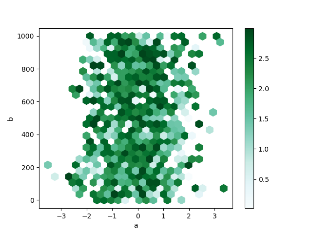
請參閱 hexbin 方法和 matplotlib hexbin 文件 以取得更多資訊。
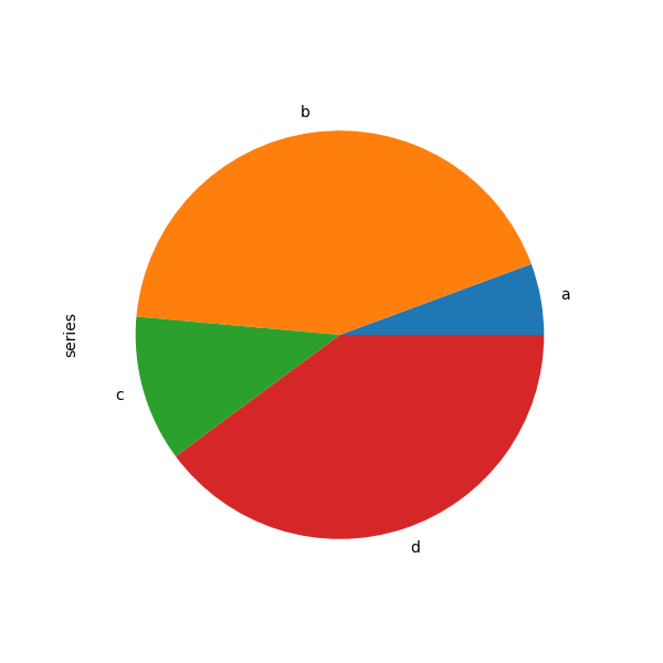
圓餅圖#
你可以使用 DataFrame.plot.pie() 或 Series.plot.pie() 建立圓餅圖。如果你的資料包含任何 NaN,它們會自動填入 0。如果你的資料中有任何負值,則會引發 ValueError。
In [85]: series = pd.Series(3 * np.random.rand(4), index=["a", "b", "c", "d"], name="series")

In [86]: series.plot.pie(figsize=(6, 6));
對於圓餅圖,最好使用正方形圖形,即圖形長寬比為 1。你可以建立寬度和高度相等的圖形,或在繪製後呼叫 ax.set_aspect('equal') 在傳回的 axes 物件上,強制長寬比相等。
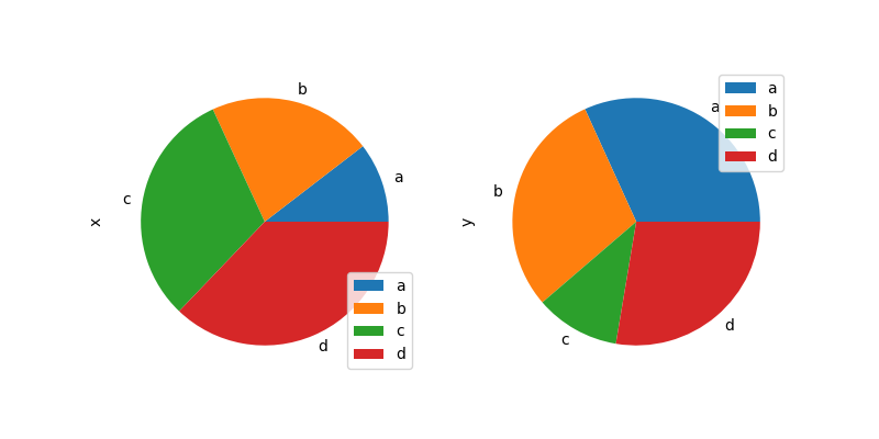
請注意,使用 DataFrame 的圓餅圖需要你透過 y 參數指定目標欄位,或 subplots=True。當指定 y 時,將繪製所選欄位的圓餅圖。如果指定 subplots=True,則每個欄位的圓餅圖會繪製為子圖。預設會在每個圓餅圖中繪製圖例;指定 legend=False 以隱藏它。
In [87]: df = pd.DataFrame(
   ....:     3 * np.random.rand(4, 2), index=["a", "b", "c", "d"], columns=["x", "y"]
   ....: )
   ....:

In [88]: df.plot.pie(subplots=True, figsize=(8, 4));
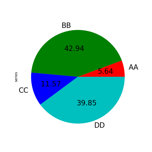
您可以使用 標籤 和 顏色 關鍵字來指定每個扇形的標籤和顏色。
警告
大多數 pandas 繪圖使用 標籤 和 顏色 參數(請注意這些參數沒有「s」)。為了與 matplotlib.pyplot.pie() 保持一致,您必須使用 標籤 和 顏色。
如果您想隱藏扇形標籤,請指定 標籤=無。如果指定 字型大小,該值將套用於扇形標籤。此外,matplotlib.pyplot.pie() 支援的其他關鍵字也可以使用。
In [89]: series.plot.pie(
   ....:     labels=["AA", "BB", "CC", "DD"],
   ....:     colors=["r", "g", "b", "c"],
   ....:     autopct="%.2f",
   ....:     fontsize=20,
   ....:     figsize=(6, 6),
   ....: );
   ....:
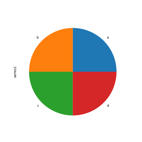
如果您傳遞總和小於 1.0 的值,它們將重新調整比例,以便總和為 1。
In [90]: series = pd.Series([0.1] * 4, index=["a", "b", "c", "d"], name="series2")

In [91]: series.plot.pie(figsize=(6, 6));
請參閱 matplotlib 圓餅圖文件 以取得更多資訊。
繪製包含遺失資料的圖形#
pandas 嘗試務實地繪製包含遺失資料的 資料框 或 資料列。遺失值會根據繪圖類型而刪除、略過或填入。
繪圖類型 |
NaN 處理 |
|---|---|
線條 |
在 NaN 處留出間隙 |
線條(堆疊) |
填入 0 |
長條圖 |
填入 0 |
散佈圖 |
刪除 NaN |
直方圖 |
刪除 NaN(按欄) |
箱型圖 |
刪除 NaN(按欄) |
面積圖 |
填入 0 |
核密度估計 |
刪除 NaN(按欄) |
六角形箱型圖 |
刪除 NaN |
圓餅圖 |
填入 0 |
如果這些預設值不符合您的需求,或者您想要明確說明如何處理遺失值,請考慮在繪製圖表前使用 fillna() 或 dropna()。
繪圖工具#
這些函式可以從 pandas.plotting 匯入,並將 Series 或 DataFrame 作為引數。
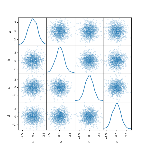
散佈矩陣圖#
您可以使用 pandas.plotting 中的 scatter_matrix 方法建立散佈矩陣圖。
In [92]: from pandas.plotting import scatter_matrix

In [93]: df = pd.DataFrame(np.random.randn(1000, 4), columns=["a", "b", "c", "d"])

In [94]: scatter_matrix(df, alpha=0.2, figsize=(6, 6), diagonal="kde");
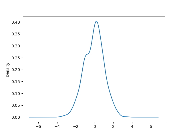
密度圖#
您可以使用 Series.plot.kde() 和 DataFrame.plot.kde() 方法建立密度圖。
In [95]: ser = pd.Series(np.random.randn(1000))

In [96]: ser.plot.kde();
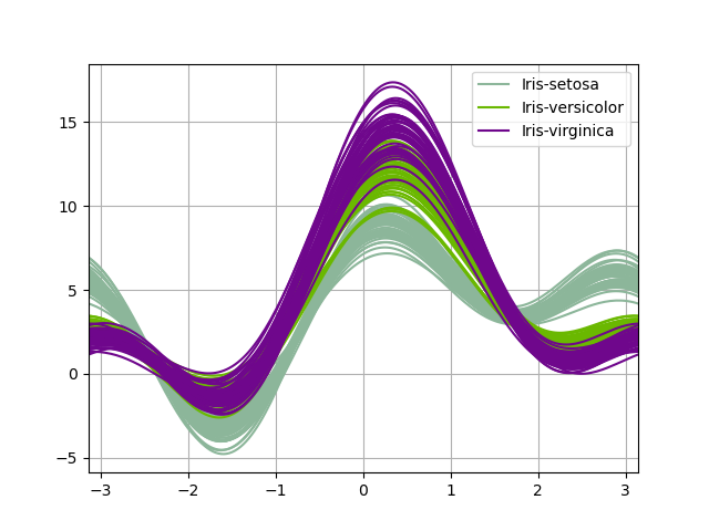
Andrews 曲線#
Andrews 曲線允許使用者將多變量資料繪製成大量曲線,這些曲線是使用樣本屬性作為傅立葉級數的係數所建立,如需更多資訊,請參閱 Wikipedia 條目。透過為每個類別為這些曲線設定不同的顏色,可以視覺化資料叢集。屬於同類別樣本的曲線通常會更接近,並形成更大的結構。
注意:在此處提供「鳶尾花」資料集。
In [97]: from pandas.plotting import andrews_curves

In [98]: data = pd.read_csv("data/iris.data")

In [99]: plt.figure();

In [100]: andrews_curves(data, "Name");
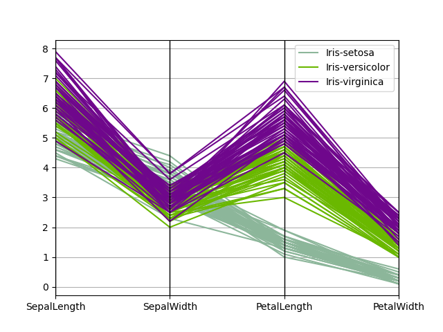
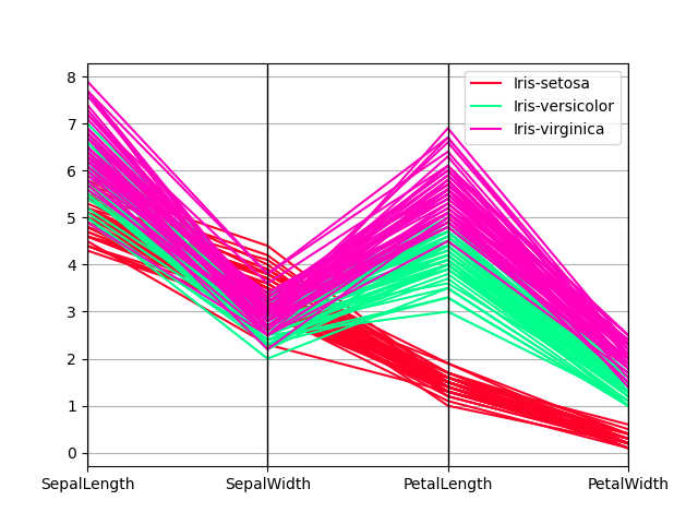
平行座標#
平行座標是一種用於繪製多變量資料的繪製技術,請參閱 Wikipedia 條目 以取得簡介。平行座標允許使用者查看資料中的叢集,並以視覺方式估計其他統計資料。使用平行座標時,點會表示為連接的線段。每條垂直線表示一個屬性。一組連接的線段表示一個資料點。傾向於叢集的點會顯示得更接近。
In [101]: from pandas.plotting import parallel_coordinates

In [102]: data = pd.read_csv("data/iris.data")

In [103]: plt.figure();

In [104]: parallel_coordinates(data, "Name");
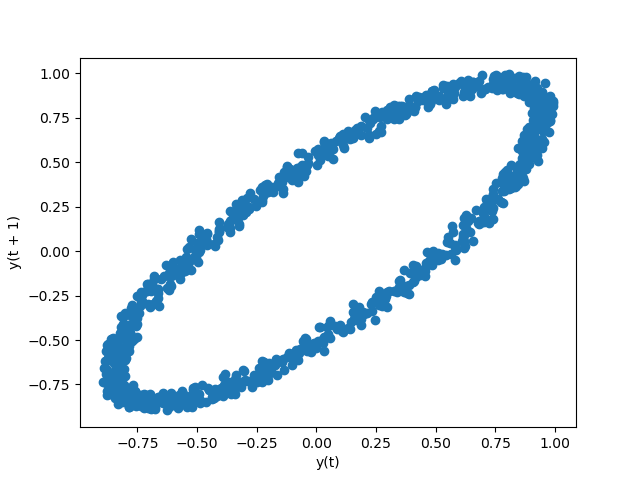
時滯圖#
時滯圖用於檢查資料集或時間序列是否為隨機。隨機資料不應在時滯圖中顯示任何結構。非隨機結構表示基礎資料並非隨機。lag 參數可以傳遞,且當 lag=1 時,此繪圖基本上為 data[:-1] 與 data[1:]。
In [105]: from pandas.plotting import lag_plot

In [106]: plt.figure();

In [107]: spacing = np.linspace(-99 * np.pi, 99 * np.pi, num=1000)

In [108]: data = pd.Series(0.1 * np.random.rand(1000) + 0.9 * np.sin(spacing))

In [109]: lag_plot(data);
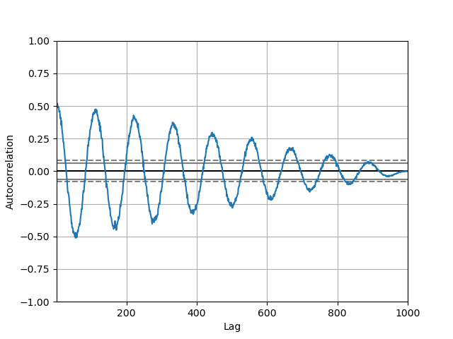
自相關圖#
自相關圖經常被用於檢查時間序列中的隨機性。這會透過計算不同時間差值資料數值的自相關來執行。如果時間序列是隨機的,此類自相關在任何時間差值分離中都應接近於零。如果時間序列是非隨機的,則一個或多個自相關將顯著非零。圖表中顯示的水平線對應於 95% 和 99% 信心區間。虛線為 99% 信心區間。請參閱 維基百科條目 以進一步了解自相關圖。
In [110]: from pandas.plotting import autocorrelation_plot

In [111]: plt.figure();

In [112]: spacing = np.linspace(-9 * np.pi, 9 * np.pi, num=1000)

In [113]: data = pd.Series(0.7 * np.random.rand(1000) + 0.3 * np.sin(spacing))

In [114]: autocorrelation_plot(data);
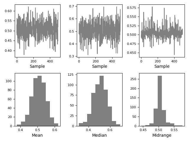
Bootstrap 圖#
Bootstrap 圖用於視覺評估統計量的變異性,例如平均值、中位數、中值範圍等。從資料集中選取指定大小的隨機子集,針對此子集計算有問題的統計量,並重複此程序指定次數。產生的圖表和直方圖構成 Bootstrap 圖。
In [115]: from pandas.plotting import bootstrap_plot

In [116]: data = pd.Series(np.random.rand(1000))

In [117]: bootstrap_plot(data, size=50, samples=500, color="grey");
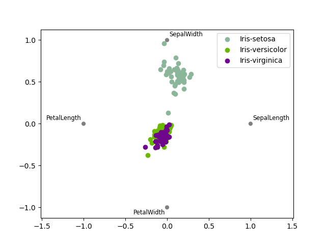
RadViz#
RadViz 是一種視覺化多變量資料的方式。它基於一個簡單的彈簧張力最小化演算法。基本上,您在平面上設定一堆點。在我們的案例中,它們均勻地分佈在單位圓上。每個點代表一個單一屬性。然後,您假裝資料集中的每個樣本都透過彈簧附著在這些點中的每一個點上,其剛度與該屬性的數值成正比(它們被標準化為單位區間)。我們的樣本穩定下來的平面上的點(作用在我們樣本上的力處於平衡狀態)是繪製代表我們樣本的點的地方。根據樣本所屬的類別,它將被塗上不同的顏色。請參閱 R 套件 Radviz 以取得更多資訊。
注意:在此處提供「鳶尾花」資料集。
In [118]: from pandas.plotting import radviz

In [119]: data = pd.read_csv("data/iris.data")

In [120]: plt.figure();

In [121]: radviz(data, "Name");
繪製格式化#
設定繪製樣式#
從 1.5 版開始,matplotlib 提供了一系列預先設定好的繪製樣式。設定樣式可用於輕鬆地為繪製提供您想要的整體外觀。設定樣式就像在建立繪製前呼叫 matplotlib.style.use(my_plot_style) 一樣簡單。例如,您可以撰寫 matplotlib.style.use('ggplot') 以取得 ggplot 風格的繪製。
您可以在 matplotlib.style.available 中看到各種可用的樣式名稱,而且很容易嘗試它們。
一般繪製樣式引數#
大多數繪製方法都有一組關鍵字引數,用於控制傳回繪製的配置和格式化
In [122]: plt.figure();

In [123]: ts.plot(style="k--", label="Series");
對於每種類型的繪製(例如 line、bar、scatter),任何額外的引數關鍵字都會傳遞到對應的 matplotlib 函式(ax.plot()、ax.bar()、ax.scatter())。這些可用於控制額外的樣式,超出 pandas 提供的範圍。
控制圖例#
您可以將 legend 參數設定為 False 以隱藏圖例,圖例預設會顯示。
In [124]: df = pd.DataFrame(np.random.randn(1000, 4), index=ts.index, columns=list("ABCD"))

In [125]: df = df.cumsum()

In [126]: df.plot(legend=False);
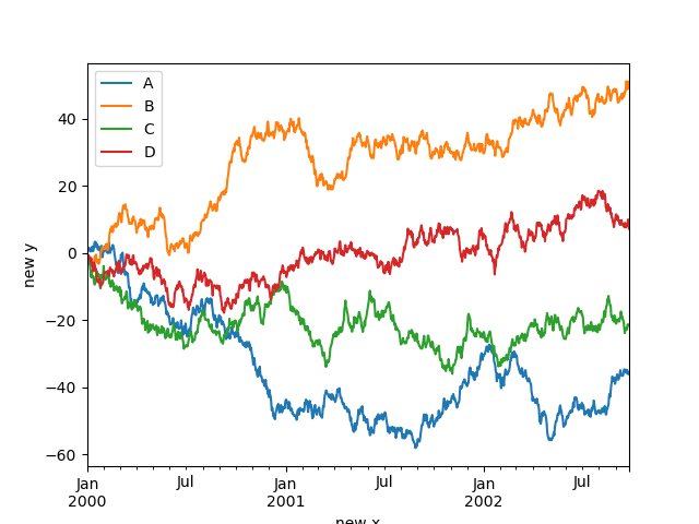
控制標籤#
您可以設定 xlabel 和 ylabel 參數,為 x 和 y 軸提供自訂標籤。預設情況下,pandas 會選取索引名稱作為 xlabel,而將 ylabel 留空。
In [127]: df.plot();

In [128]: df.plot(xlabel="new x", ylabel="new y");
比例#
您可以傳遞 logy 以取得 log 尺度的 Y 軸。
In [129]: ts = pd.Series(np.random.randn(1000), index=pd.date_range("1/1/2000", periods=1000))

In [130]: ts = np.exp(ts.cumsum())

In [131]: ts.plot(logy=True);
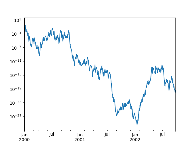
另請參閱 logx 和 loglog 關鍵字參數。
在次要 y 軸上繪製圖形#
若要在次要 y 軸上繪製資料,請使用 secondary_y 關鍵字
In [132]: df["A"].plot();

In [133]: df["B"].plot(secondary_y=True, style="g");
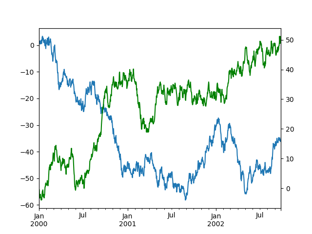
若要在 DataFrame 中繪製一些欄,請將欄名稱提供給 secondary_y 關鍵字
In [134]: plt.figure();

In [135]: ax = df.plot(secondary_y=["A", "B"])

In [136]: ax.set_ylabel("CD scale");

In [137]: ax.right_ax.set_ylabel("AB scale");
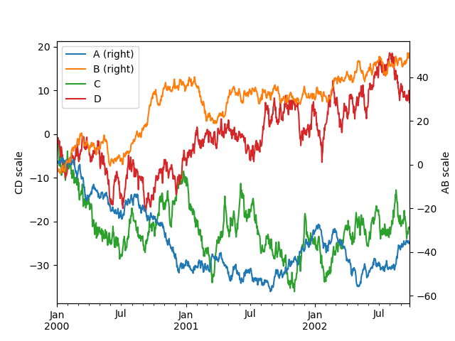
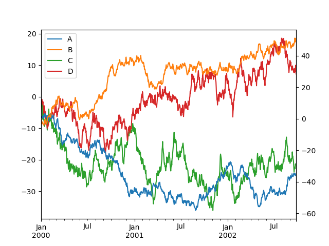
請注意,繪製在次要 y 軸上的欄會在圖例中自動標記為「(右)」。若要關閉自動標記,請使用 mark_right=False 關鍵字
In [138]: plt.figure();

In [139]: df.plot(secondary_y=["A", "B"], mark_right=False);
時間序列圖形的自訂格式化器#
pandas 提供自訂格式化器,用於時序圖表。這些格式化器會變更日期和時間的軸標籤格式。預設情況下,自訂格式化器僅套用至使用 DataFrame.plot() 或 Series.plot() 所建立的圖表。若要將這些格式化器套用至所有圖表(包括 matplotlib 所建立的圖表),請設定選項 pd.options.plotting.matplotlib.register_converters = True 或使用 pandas.plotting.register_matplotlib_converters()。
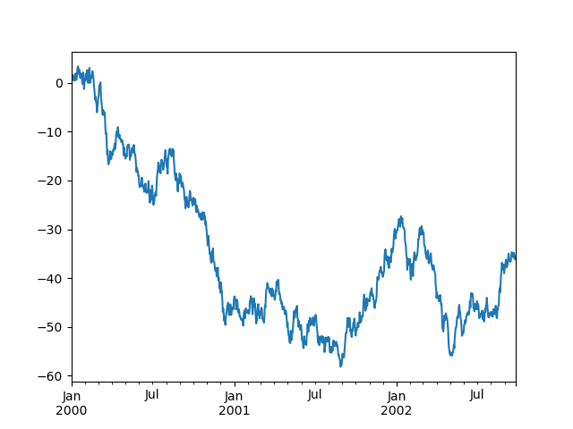
抑制刻度解析度調整#
pandas 包含針對一般頻率時間序列資料的自動刻度解析度調整。對於 pandas 無法推斷頻率資訊的有限情況(例如,在外部建立的 twinx 中),您可以選擇抑制此行為以進行對齊。
以下是預設行為,請注意 x 軸刻度標籤的執行方式
In [140]: plt.figure();

In [141]: df["A"].plot();
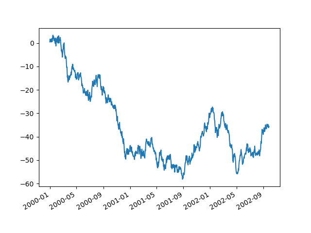
使用 x_compat 參數,您可以抑制此行為
In [142]: plt.figure();

In [143]: df["A"].plot(x_compat=True);
如果您有多個需要抑制的圖表,則 use 方法在 pandas.plotting.plot_params 中可用於 with 陳述式
In [144]: plt.figure();

In [145]: with pd.plotting.plot_params.use("x_compat", True):
   .....:     df["A"].plot(color="r")
   .....:     df["B"].plot(color="g")
   .....:     df["C"].plot(color="b")
   .....:
自動日期刻度調整#
TimedeltaIndex 現在使用原生 matplotlib 刻度定位器方法,對於刻度標籤重疊的圖形,呼叫 matplotlib 的自動日期刻度調整很有用。
請參閱 autofmt_xdate 方法和 matplotlib 文件 以進一步了解。
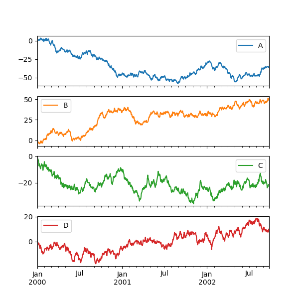
子區塊#
在 DataFrame 中的每個 Series 都可以使用 subplots 關鍵字在不同的軸線上繪製
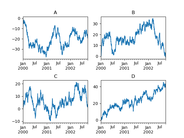
In [146]: df.plot(subplots=True, figsize=(6, 6));
使用配置和鎖定多個軸線#
子區塊的配置可以使用 layout 關鍵字指定。它可以接受 (rows, columns)。 layout 關鍵字也可以用於 hist 和 boxplot。如果輸入無效,將會產生 ValueError。
由 layout 指定的行數 x 欄數中可以包含的軸線數量必須大於所需的子區塊數量。如果配置可以包含比所需更多的軸線,則不會繪製空白軸線。類似於 NumPy 陣列的 reshape 方法,您可以對一個維度使用 -1,以根據另一個維度自動計算所需的行數或欄數。
In [147]: df.plot(subplots=True, layout=(2, 3), figsize=(6, 6), sharex=False);
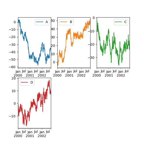
上述範例等同於使用
In [148]: df.plot(subplots=True, layout=(2, -1), figsize=(6, 6), sharex=False);
所需的欄位數 (3) 是從要繪製的系列數和給定的列數 (2) 推論出來的。
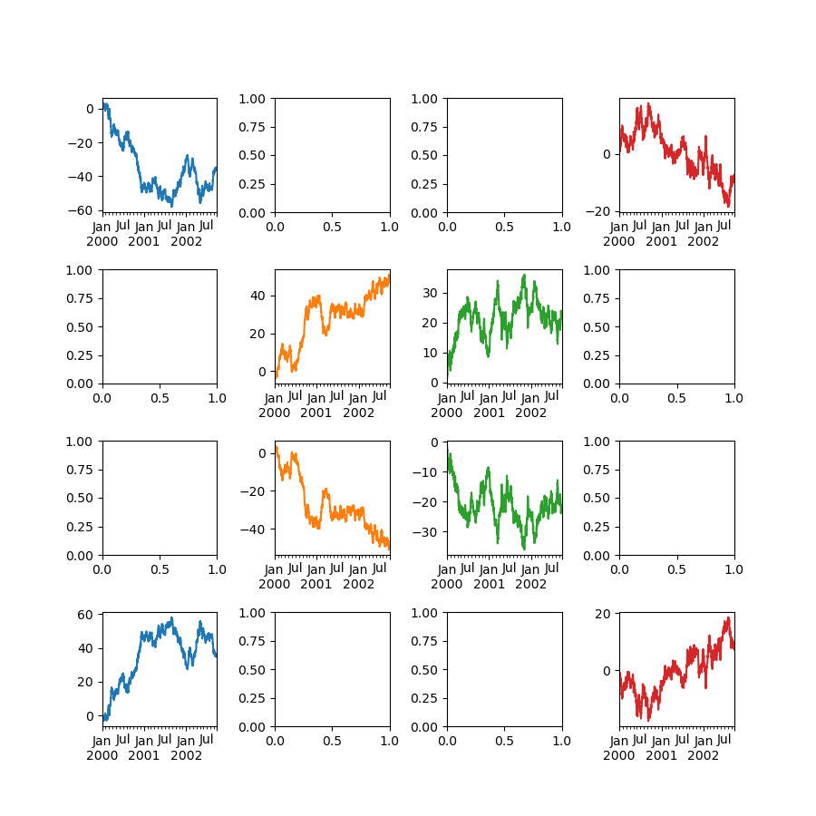
你可以透過 ax 關鍵字將事先建立的複數軸傳遞為類似清單的內容。這允許更複雜的配置。傳遞的軸必須與要繪製的子繪圖數量相同。
當透過 ax 關鍵字傳遞複數軸時,layout、sharex 和 sharey 關鍵字不會影響輸出。你應該明確傳遞 sharex=False 和 sharey=False,否則你會看到一個警告。
In [149]: fig, axes = plt.subplots(4, 4, figsize=(9, 9))

In [150]: plt.subplots_adjust(wspace=0.5, hspace=0.5)

In [151]: target1 = [axes[0][0], axes[1][1], axes[2][2], axes[3][3]]

In [152]: target2 = [axes[3][0], axes[2][1], axes[1][2], axes[0][3]]

In [153]: df.plot(subplots=True, ax=target1, legend=False, sharex=False, sharey=False);

In [154]: (-df).plot(subplots=True, ax=target2, legend=False, sharex=False, sharey=False);
另一個選項是傳遞 ax 參數給 Series.plot() 以在特定軸上繪製
In [155]: np.random.seed(123456)

In [156]: ts = pd.Series(np.random.randn(1000), index=pd.date_range("1/1/2000", periods=1000))

In [157]: ts = ts.cumsum()

In [158]: df = pd.DataFrame(np.random.randn(1000, 4), index=ts.index, columns=list("ABCD"))

In [159]: df = df.cumsum()
In [160]: fig, axes = plt.subplots(nrows=2, ncols=2)

In [161]: plt.subplots_adjust(wspace=0.2, hspace=0.5)

In [162]: df["A"].plot(ax=axes[0, 0]);

In [163]: axes[0, 0].set_title("A");

In [164]: df["B"].plot(ax=axes[0, 1]);

In [165]: axes[0, 1].set_title("B");

In [166]: df["C"].plot(ax=axes[1, 0]);

In [167]: axes[1, 0].set_title("C");

In [168]: df["D"].plot(ax=axes[1, 1]);

In [169]: axes[1, 1].set_title("D");
使用誤差線繪製#
在 DataFrame.plot() 和 Series.plot() 中支援使用誤差線繪製。
水平和垂直誤差線可以提供給 xerr 和 yerr 關鍵字參數,以 plot()。錯誤值可以使用各種格式指定
作為
DataFrame或dict的錯誤,其欄位名稱與繪製DataFrame的columns屬性相符,或與Series的name屬性相符。作為
str,指出繪製DataFrame的哪個欄位包含錯誤值。作為原始值 (
list、tuple或np.ndarray)。長度必須與繪圖DataFrame/Series相同。
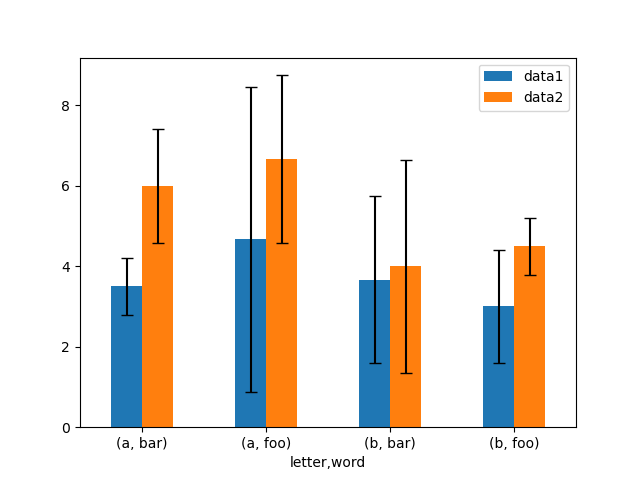
以下是一個輕鬆繪製原始資料的群組平均值與標準差的方法範例。
# Generate the data
In [170]: ix3 = pd.MultiIndex.from_arrays(
   .....:     [
   .....:         ["a", "a", "a", "a", "a", "b", "b", "b", "b", "b"],
   .....:         ["foo", "foo", "foo", "bar", "bar", "foo", "foo", "bar", "bar", "bar"],
   .....:     ],
   .....:     names=["letter", "word"],
   .....: )
   .....:

In [171]: df3 = pd.DataFrame(
   .....:     {
   .....:         "data1": [9, 3, 2, 4, 3, 2, 4, 6, 3, 2],
   .....:         "data2": [9, 6, 5, 7, 5, 4, 5, 6, 5, 1],
   .....:     },
   .....:     index=ix3,
   .....: )
   .....:

# Group by index labels and take the means and standard deviations
# for each group
In [172]: gp3 = df3.groupby(level=("letter", "word"))

In [173]: means = gp3.mean()

In [174]: errors = gp3.std()

In [175]: means
Out[175]:
                data1     data2
letter word
a      bar   3.500000  6.000000
       foo   4.666667  6.666667
b      bar   3.666667  4.000000
       foo   3.000000  4.500000

In [176]: errors
Out[176]:
                data1     data2
letter word
a      bar   0.707107  1.414214
       foo   3.785939  2.081666
b      bar   2.081666  2.645751
       foo   1.414214  0.707107

# Plot
In [177]: fig, ax = plt.subplots()

In [178]: means.plot.bar(yerr=errors, ax=ax, capsize=4, rot=0);
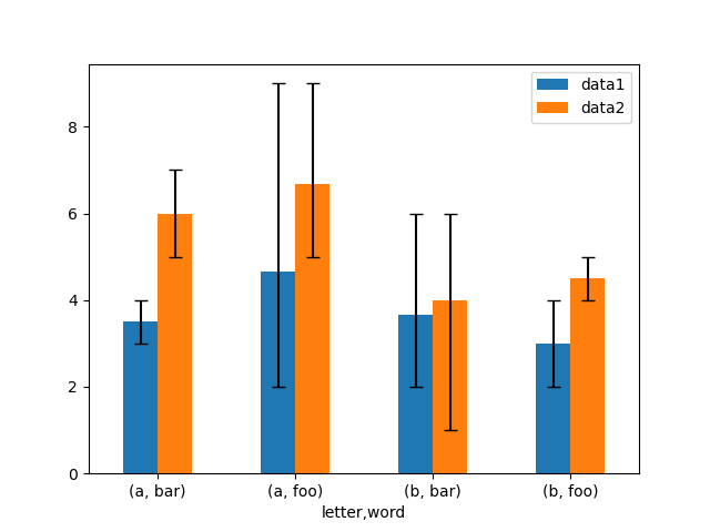
不對稱的誤差棒也受到支援,但這種情況下必須提供原始誤差值。對於長度為 N 的 Series,應該提供一個 2xN 陣列,表示較低和較高(或左右)的誤差。對於長度為 MxN 的 DataFrame,不對稱的誤差應該在一個 Mx2xN 陣列中。
以下是一個使用不對稱誤差棒繪製最小/最大範圍的方法範例。
In [179]: mins = gp3.min()

In [180]: maxs = gp3.max()

# errors should be positive, and defined in the order of lower, upper
In [181]: errors = [[means[c] - mins[c], maxs[c] - means[c]] for c in df3.columns]

# Plot
In [182]: fig, ax = plt.subplots()

In [183]: means.plot.bar(yerr=errors, ax=ax, capsize=4, rot=0);
繪製表格#
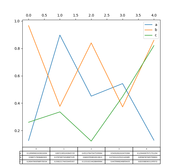
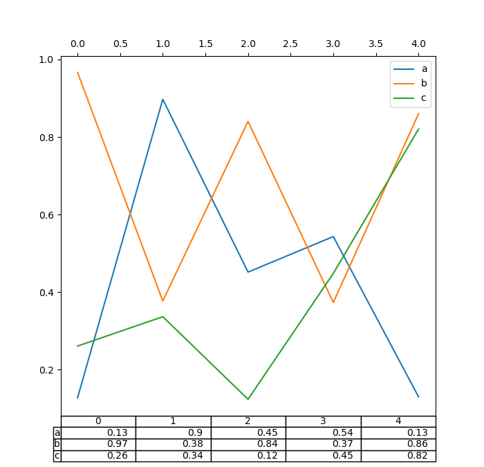
現在支援在 DataFrame.plot() 和 Series.plot() 中使用 matplotlib 表格,並搭配 table 關鍵字。 table 關鍵字可以接受 bool、DataFrame 或 Series。要繪製表格的簡單方法是指定 table=True。資料會轉置以符合 matplotlib 的預設配置。
In [184]: np.random.seed(123456)

In [185]: fig, ax = plt.subplots(1, 1, figsize=(7, 6.5))

In [186]: df = pd.DataFrame(np.random.rand(5, 3), columns=["a", "b", "c"])

In [187]: ax.xaxis.tick_top()  # Display x-axis ticks on top.

In [188]: df.plot(table=True, ax=ax);
此外,您可以將不同的 DataFrame 或 Series 傳遞給 table 關鍵字。資料會以在列印方法中顯示的方式繪製(不會自動轉置)。如有需要,應如以下範例所示手動轉置。
In [189]: fig, ax = plt.subplots(1, 1, figsize=(7, 6.75))

In [190]: ax.xaxis.tick_top()  # Display x-axis ticks on top.

In [191]: df.plot(table=np.round(df.T, 2), ax=ax);
還有一個輔助函式 pandas.plotting.table,它會從 DataFrame 或 Series 建立一個表格,並將它加入 matplotlib.Axes 實例中。這個函式可以接受 matplotlib table 中的關鍵字。
In [192]: from pandas.plotting import table

In [193]: fig, ax = plt.subplots(1, 1)

In [194]: table(ax, np.round(df.describe(), 2), loc="upper right", colWidths=[0.2, 0.2, 0.2]);

In [195]: df.plot(ax=ax, ylim=(0, 2), legend=None);
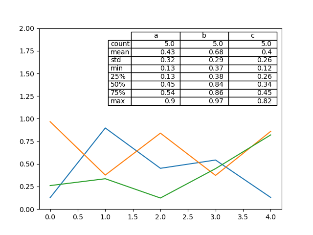
注意:您可以使用 axes.tables 屬性取得軸上的表格實例,以便進一步裝飾。有關更多資訊,請參閱 matplotlib 表格文件。
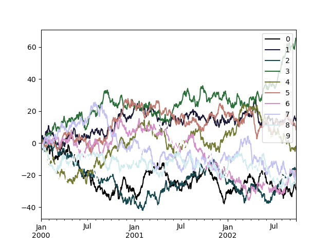
色彩對應表#
繪製大量資料欄時,可能會遇到的問題是,由於預設色彩重複,因此很難區分某些系列。為了解決這個問題,DataFrame 繪製支援使用 colormap 參數,它接受 Matplotlib 色彩對應表 或註冊在 Matplotlib 中的色彩對應表名稱字串。預設 matplotlib 色彩對應表的視覺化資訊可在此處 取得。
由於 matplotlib 不直接支援線條圖的色彩對應表,因此色彩會根據 DataFrame 中的欄位數目,以均勻的間距進行選擇。沒有考慮背景色彩,因此有些色彩對應表會產生不易看見的線條。
若要使用 cubehelix 色彩對應表,我們可以傳遞 colormap='cubehelix'。
In [196]: np.random.seed(123456)

In [197]: df = pd.DataFrame(np.random.randn(1000, 10), index=ts.index)

In [198]: df = df.cumsum()

In [199]: plt.figure();

In [200]: df.plot(colormap="cubehelix");

或者,我們可以傳遞色彩對應表本身
In [201]: from matplotlib import cm

In [202]: plt.figure();

In [203]: df.plot(colormap=cm.cubehelix);
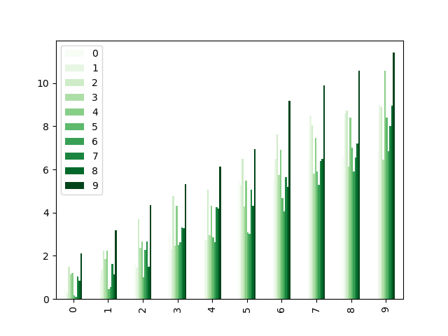
色彩對應表也可以用於其他圖形類型,例如長條圖
In [204]: np.random.seed(123456)

In [205]: dd = pd.DataFrame(np.random.randn(10, 10)).map(abs)

In [206]: dd = dd.cumsum()

In [207]: plt.figure();

In [208]: dd.plot.bar(colormap="Greens");
平行坐標圖
In [209]: plt.figure();

In [210]: parallel_coordinates(data, "Name", colormap="gist_rainbow");
Andrews 曲線圖
In [211]: plt.figure();

In [212]: andrews_curves(data, "Name", colormap="winter");

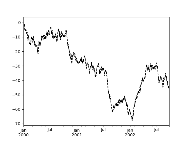
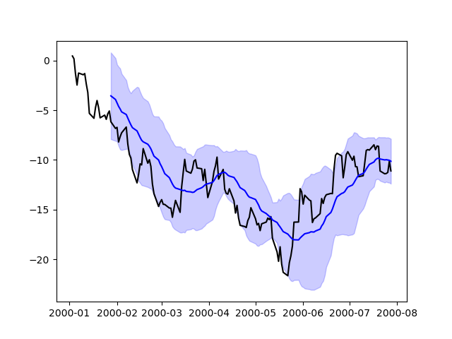
直接使用 Matplotlib 繪圖#
在某些情況下,可能仍然需要或較好直接使用 matplotlib 準備圖形,例如當 pandas(尚未)支援某種類型的圖形或自訂功能時。 Series 和 DataFrame 物件的行為類似陣列,因此可以不透過明確轉換直接傳遞給 matplotlib 函式。
pandas 也會自動註冊識別日期索引的格式化程式和定位器,從而將日期和時間支援擴充到 matplotlib 中幾乎所有可用的圖形類型。雖然這種格式化無法提供透過 pandas 繪圖時可獲得的相同精緻度,但在繪製大量點時速度會較快。
In [213]: np.random.seed(123456)

In [214]: price = pd.Series(
   .....:     np.random.randn(150).cumsum(),
   .....:     index=pd.date_range("2000-1-1", periods=150, freq="B"),
   .....: )
   .....:

In [215]: ma = price.rolling(20).mean()

In [216]: mstd = price.rolling(20).std()

In [217]: plt.figure();

In [218]: plt.plot(price.index, price, "k");

In [219]: plt.plot(ma.index, ma, "b");

In [220]: plt.fill_between(mstd.index, ma - 2 * mstd, ma + 2 * mstd, color="b", alpha=0.2);
繪圖後端#
pandas 可以透過第三方繪圖後端進行擴充。其主要概念是讓使用者選擇不同於 Matplotlib 所提供的繪圖後端。
這可以透過在 plot 函式中傳遞 ‘backend.module’ 作為引數 backend 來完成。例如
>>> Series([1, 2, 3]).plot(backend="backend.module")
或者,您也可以全局設定此選項,這樣就不需要在每個 plot 呼叫中指定關鍵字。例如
>>> pd.set_option("plotting.backend", "backend.module")
>>> pd.Series([1, 2, 3]).plot()
或者
>>> pd.options.plotting.backend = "backend.module"
>>> pd.Series([1, 2, 3]).plot()
這將或多或少等於
>>> import backend.module
>>> backend.module.plot(pd.Series([1, 2, 3]))
然後,後端模組可以使用其他視覺化工具(Bokeh、Altair、hvplot 等)來產生圖表。實作 pandas 後端的某些函式庫列於 生態系頁面。
開發人員指南可在 https://pandas.dev.org.tw/docs/dev/development/extending.html#plotting-backends 找到